Sunburst


|
Sunburst |
|
|
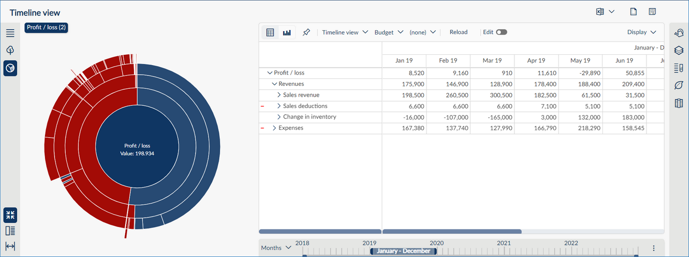
In the sunburst chart, each hierarchy level in the structure is represented by a ring or circle, with the innermost circle as your selected hierarchy level. The sunburst chart is also used for analysing the structure. It shows how the outer rings relate to the inner rings and how a ring is divided into its contributing parts (fields). Expenses and revenues are shown in a red/blue colour scheme, whereas negative and positive variances in analyses are shown in a red/green colour scheme.
When selecting the sunburst chart, you can also choose how much of the screen the chart should occupy, i.e. a minimised display, a half-screen display or a full-screen display.
To navigate in the sunburst chart, click the desired field in a hierarchy level (ring). Above the chart you will see the breadcrumb trail. To return to a higher hierarchy level, click the desired entry in the breadcrumb trail.
|